In photography, one of the essential elements that can make your photos stand out is the use of colours. Using contrasting colours in your photos can create a dynamic and visually appealing effect that captures the viewer’s attention. In this blog post, we will explore how using contrasting colours in photography can make your shots better.
Contrasting colours refer to colours that are opposite each other on the colour wheel. These colours create a stark contrast that can be used to draw attention to certain parts of an image. Also known as complementary colors, they are:
Yellow and Purple
Green and Red
Blue and Orange
Here are some reasons why using contrasting colours in photography can make your shots better:
Adds Visual Interest
Contrasting colours create a dynamic and visually interesting effect that captures the viewer’s attention. Using contrasting colours in your photos can help you create images that are striking and memorable. By playing with contrasting colours, you can create a visual language that conveys different emotions and moods.
Helps Define the Subject
Contrasting colours can help you define the subject in your photos. By using contrasting colours, you can draw attention to the subject, making it stand out from the background. For example, if you are taking a portrait photo, using contrasting colours can help you highlight the subject’s eyes or facial features, making the photo more engaging.
Creates Depth and Dimension
Contrasting colours can also help create depth and dimension in your photos. By using colours that contrast with each other, you can create a sense of depth and make your photos look more three-dimensional. This can help your photos look more immersive and engaging, drawing the viewer into the scene.
Enhances Mood and Emotion
Using contrasting colours can help you enhance the mood and emotion of your photos. For example, warm colours like red, orange, and yellow can create a sense of energy and excitement, while cool colours like blue and green can create a more calming and peaceful effect. By using contrasting colours, you can create images that evoke different emotions and moods.
See how the purples in this image become more vibrant against a yellow background.

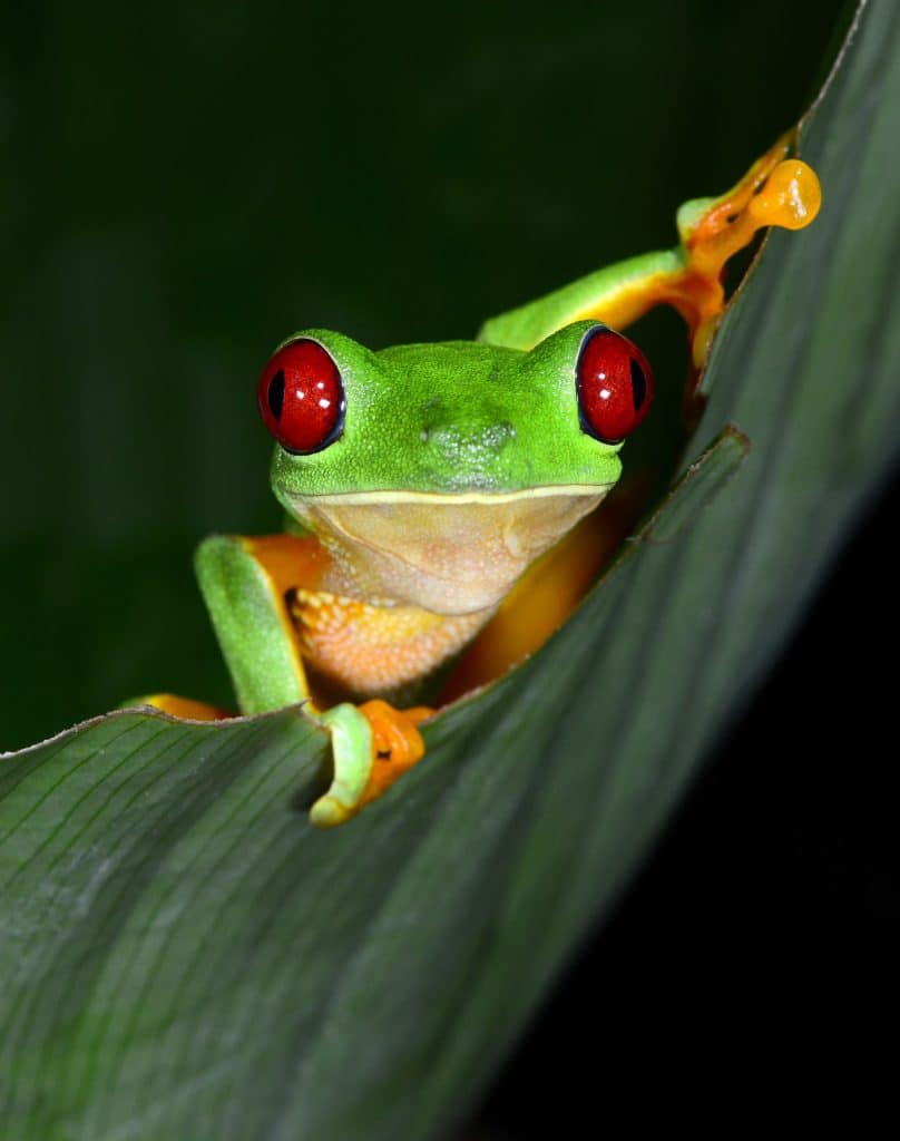
This image of a tree frog is made all the more striking by the deep contrasting colours of the eyes and the rest of the green in the image.
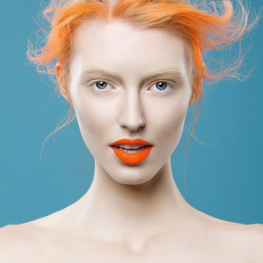
In this portrait, the photographer has used contrasting colours, blue and orange, to create a visually stimulating image.
Using contrasting colours in photography can make your shots better by adding visual interest, defining the subject, creating depth and dimension, and enhancing mood and emotion. Whether taking landscape photos or portraits, playing with contrasting colours can help you create images that stand out and capture the viewer’s attention. So, next time you’re out with your camera, try experimenting with contrasting colours and see how they can enhance your shots.